portfolio > godfrey phillips india
Tapping into ethnography to build a brand with special affinity

Globally, the cigarette industry has been under siege from governments and the society, with avenues for creating new brands almost drying up. This has been due to a host of factors, ranging from media blackouts, graphic health advisories, and more.
A new way of segmentation
India’s second largest cigarette manufacturer, Godfrey Phillips, was experiencing limits to growth, when they started exploring new opportunities. These ranged from venturing into new categories such as pan masala and bidis, and wider geographical push beyond their traditional strongholds in the north and west India. It also involved looking at the possibility of developing a new brand based on ethnography. Just as in markets like the US, where cigarette brands specifically aimed at the Hispanics and blacks do exist, it was decided to test a similar hypothesis in the Indian context, vis-à-vis linguistic or religious groups like Malayalees and Muslims. We worked on the latter, with two specific considerations: first, that such branding has to operate with (literally) the pack as the only canvas available. And second, that while such a brand must create natural affinity among the intended audience, it must not alienate the general user.
Cultural codes and aspirational values
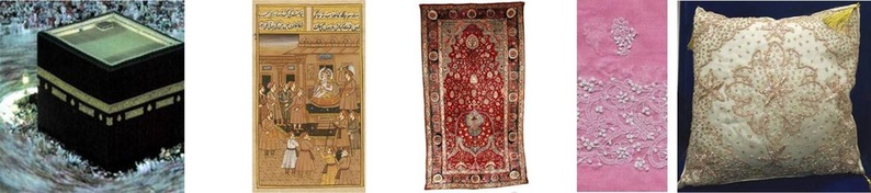
We began an intensive exploration and immersion exercise where we interacted with Muslim men in their own milieu, besides studying Muslim crafts and cultural signatures – revered colours, miniature painting, carpet weaving, embroidery (chikan, zardozi), materials (velvet, marble), architecture, inlay work, calendar art, sufi symbols, and the hugely influential Hindi movies.
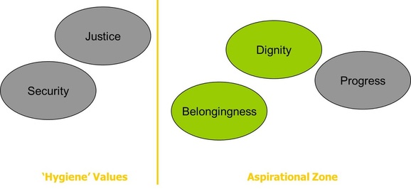
What emerged often surprised us – values that were found to be aspirational were dignity and belongingness (not the much talked about justice and security, which were seen as ‘hygiene’), the primacy of black colour (not green), desire to create a fortune through one’s own business, or in a place like Dubai (not by getting a supposedly prized government job, especially in the police where the community is under-represented). We crafted a wide range of visual codes, overlayed with relevant values – sometimes in an overt manner, sometimes subliminally, but always ensuring there was nothing offensive in our interpretation or usage.
Rigorous testing, and a (possibly) wise decision
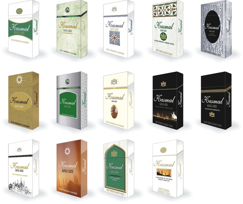
The packs underwent two rounds of rigourous testing, in Hyderabad and Lucknow, with refinements and shortlisting at each stage. The final round had a couple of options that met most of the launch criteria. Finally, it was the management’s decision not to go ahead with the launch – a decision guided by prudence, and recognition of the fact that in India such an offering could be unwittingly or deliberately perceived as an act of sacrilege, and end up creating totally avoidable controversy.
A new way of segmentation
India’s second largest cigarette manufacturer, Godfrey Phillips, was experiencing limits to growth, when they started exploring new opportunities. These ranged from venturing into new categories such as pan masala and bidis, and wider geographical push beyond their traditional strongholds in the north and west India. It also involved looking at the possibility of developing a new brand based on ethnography. Just as in markets like the US, where cigarette brands specifically aimed at the Hispanics and blacks do exist, it was decided to test a similar hypothesis in the Indian context, vis-à-vis linguistic or religious groups like Malayalees and Muslims. We worked on the latter, with two specific considerations: first, that such branding has to operate with (literally) the pack as the only canvas available. And second, that while such a brand must create natural affinity among the intended audience, it must not alienate the general user.
Cultural codes and aspirational values
We began an intensive exploration and immersion exercise where we interacted with Muslim men in their own milieu, besides studying Muslim crafts and cultural signatures – revered colours, miniature painting, carpet weaving, embroidery (chikan, zardozi), materials (velvet, marble), architecture, inlay work, calendar art, sufi symbols, and the hugely influential Hindi movies.
What emerged often surprised us – values that were found to be aspirational were dignity and belongingness (not the much talked about justice and security, which were seen as ‘hygiene’), the primacy of black colour (not green), desire to create a fortune through one’s own business, or in a place like Dubai (not by getting a supposedly prized government job, especially in the police where the community is under-represented). We crafted a wide range of visual codes, overlayed with relevant values – sometimes in an overt manner, sometimes subliminally, but always ensuring there was nothing offensive in our interpretation or usage.
Rigorous testing, and a (possibly) wise decision
The packs underwent two rounds of rigourous testing, in Hyderabad and Lucknow, with refinements and shortlisting at each stage. The final round had a couple of options that met most of the launch criteria. Finally, it was the management’s decision not to go ahead with the launch – a decision guided by prudence, and recognition of the fact that in India such an offering could be unwittingly or deliberately perceived as an act of sacrilege, and end up creating totally avoidable controversy.
What is aspirational for this audience
Identifying the cultural signatures

Some of the pack designs that were tested